Introduction
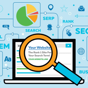
Many people put a lot of hard work into their website, but it just isn’t generating the traffic they were hoping for. There are many reasons this could be happening, but most likely it is because you are making one of these common web design mistakes that are preventing your website from reaching its full potential.
If there are 13 reasons why a show can be popular, there are at least 25 reasons why a website struggles to get traffic. Check out this article to find out 25 reasons why your website isn’t generating traffic and what you can do to avoid those.
Web Design Mistakes #1. Your Website is New and no One Knows it Exists Yet
This is certainly an issue when you are new in the business. But it is not a stopper to achieving your dreams. If this is one of the reasons why your business is failing, there are 100s of solutions to how it can be sorted.
The simplest solution is to start paying for advertisements or working with an agency that will help you get noticed by people who might be interested in your product or service. There are many other ways to make your new website known:
1. Be active on social media
The first and most important thing you should do is to be active on social media. It is the most powerful tool you have to reach new people and it’s free. So make sure you are using it to its full potential. Create a profile for your business on all the major social media platforms and start posting interesting content that will get people to notice you.
2. Have your friends and family share your content
Another great way to get started is to have your friends and family share your content. If you can get them to like and share your posts, it will reach their networks and you will start getting more traffic.
3. Use forums
Forums are a great way to get noticed by people who are interested in your niche. Find relevant forums and start participating in the discussions. Make sure you add a link to your website in your signature so people can find it.
4. Guest blogging
Guest blogging is another great way to get exposure for your website. Find blogs that are related to your niche and offer to write a guest post. This will give you a chance to promote your website to their audience.
5. Pay per click advertising
If you want to get immediate results, you can try pay-per-click advertising. This is a form of advertising where you only pay when someone clicks on your ad. It’s a great way to get targeted traffic to your website.
There are all sorts of ways you can make yourself more visible. You may not realize it, but even one thing will improve your chances by miles! If done right.
Web Design Mistakes #2. You Don’t Have Any Backlinks
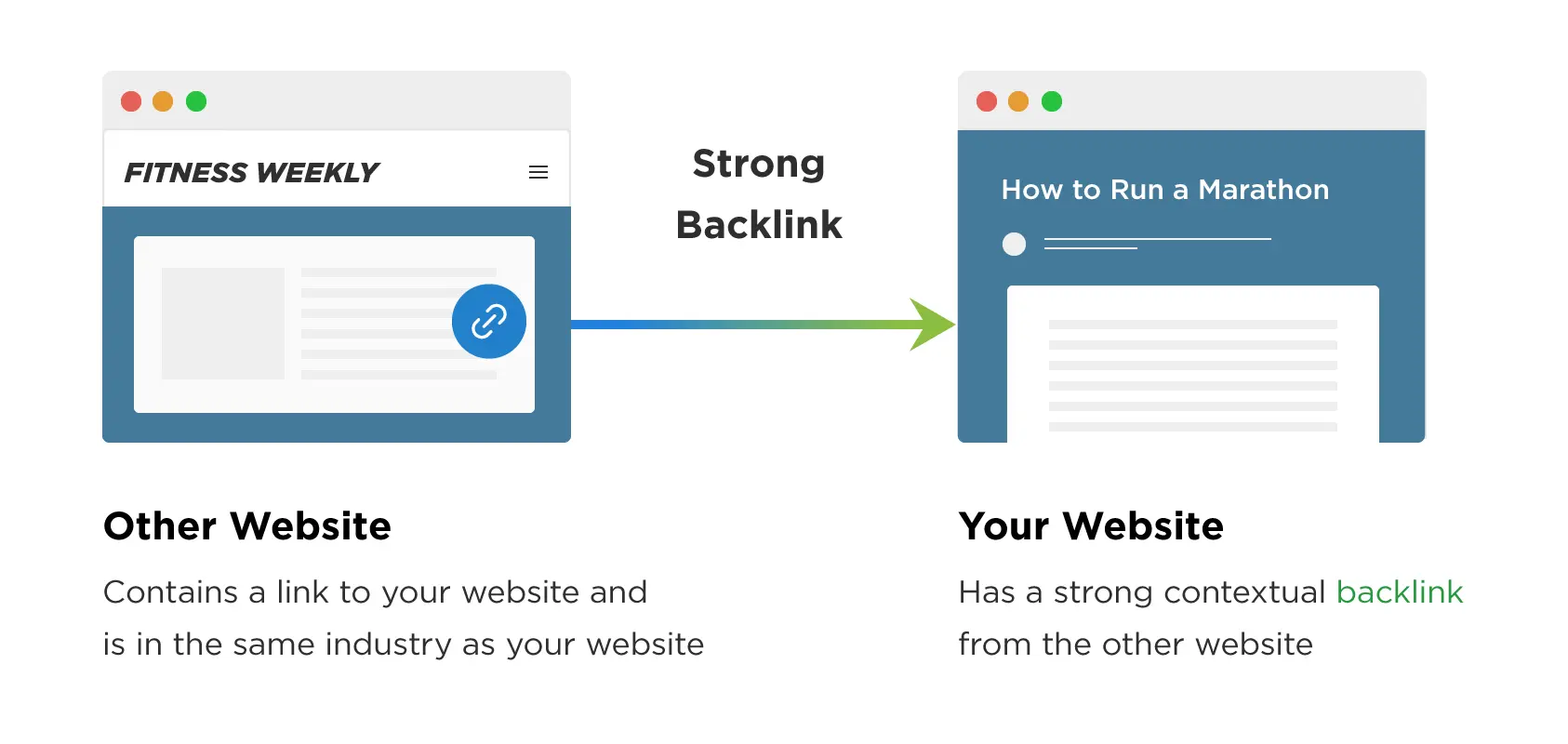
Having backlinks is a must! If you did not read that right, let me tell you again. “HAVING BACKLINKS IS A MUST”. Why? you may ask.
My website has content, it has a great UX, and even my products are not that bad, so what is the deal with backlinks?
The deal is that they are essential for SEO. They show Google that your website is popular and that it is being linked to other websites. This helps your website rank higher in the search results, which leads to more traffic.
If you don’t have any backlinks, you are missing out on a lot of traffic. But don’t worry, there are many ways to get backlinks. You can start by reaching out to other websites in your niche and asking for a link. You can also guest blog or write articles for other websites. If you have good content, people will be happy to link to it.
Web Design Mistakes #3. You Don’t Have an Email List
\
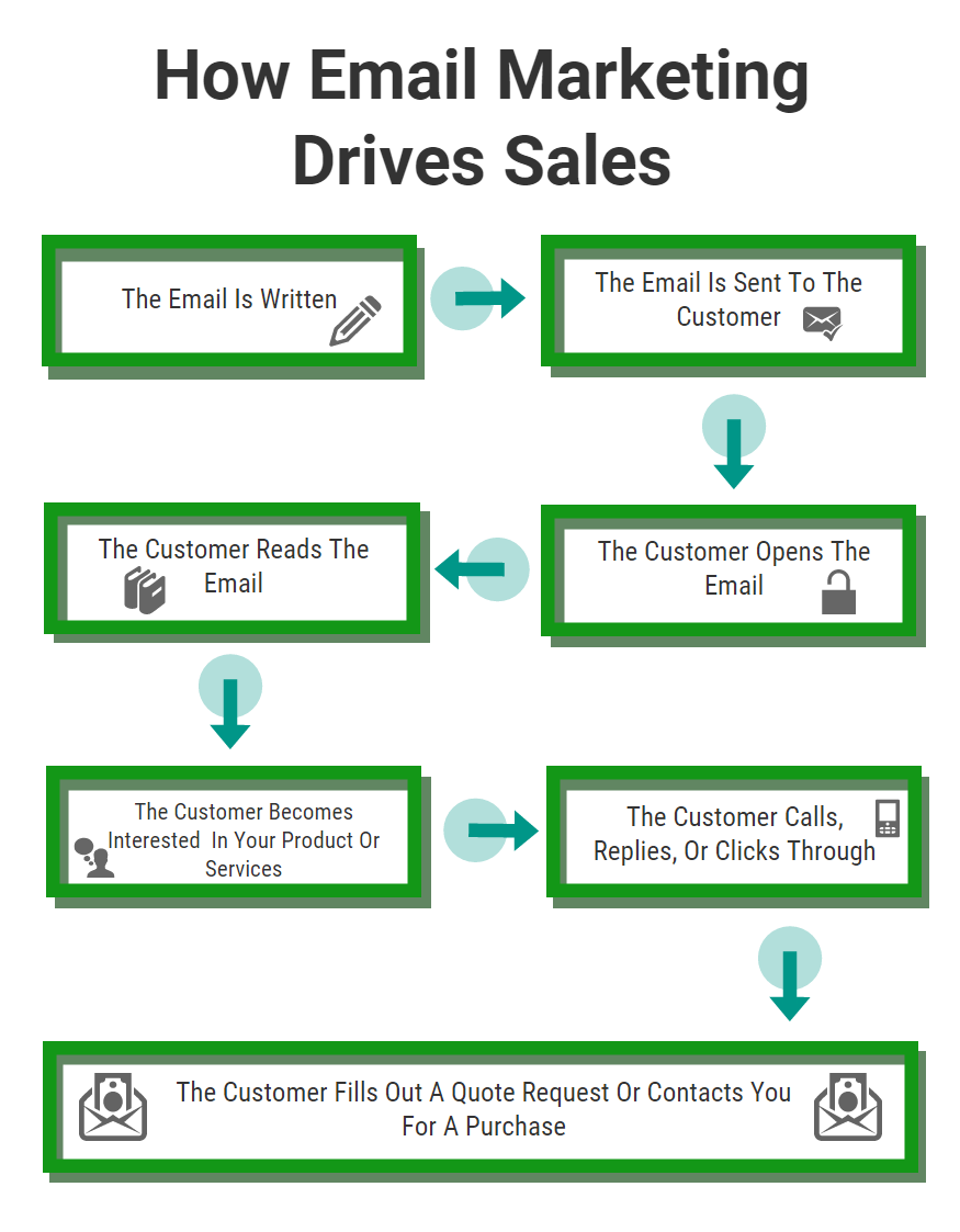
Emails are so outdated! Grhhh! and we know! But they are still one of the most effective ways to reach your target audience.
A survey by McKinsey & Company found that email is 40 times more effective at acquiring new customers than Facebook and Twitter combined. So if you are not building an email list, you are missing out on a lot of potential traffic.
The best way to build an email list is to offer something for free in exchange for people’s email addresses. This can be an ebook, a course, or anything else that is valuable to your target audience. Once you have their email address, you can send them updates about your website and new content that you have published.
Web Design Mistakes #4. You’re Not Utilizing Social Media
Silly right? Perhaps it is even more silly if you have a social media handle and your posts are not always about sweet treats. You must be active in all of them. If you want to increase traffic to your website, you need to be active on social media along with giving out generous offers to those who follow you. If you give out value, people will follow you and share your content.
Even more, the best way to use social media is to share your content with your followers and ask them to share it with their networks. Make it a game, or even a trend, social media enthusiasts love anything that will up their game on the platform.
You should also use hashtags so people can find your content. And don’t forget to post interesting and engaging content that will get people to notice you.
Web Design Mistakes #5. Your Website is not optimized for Search Engines
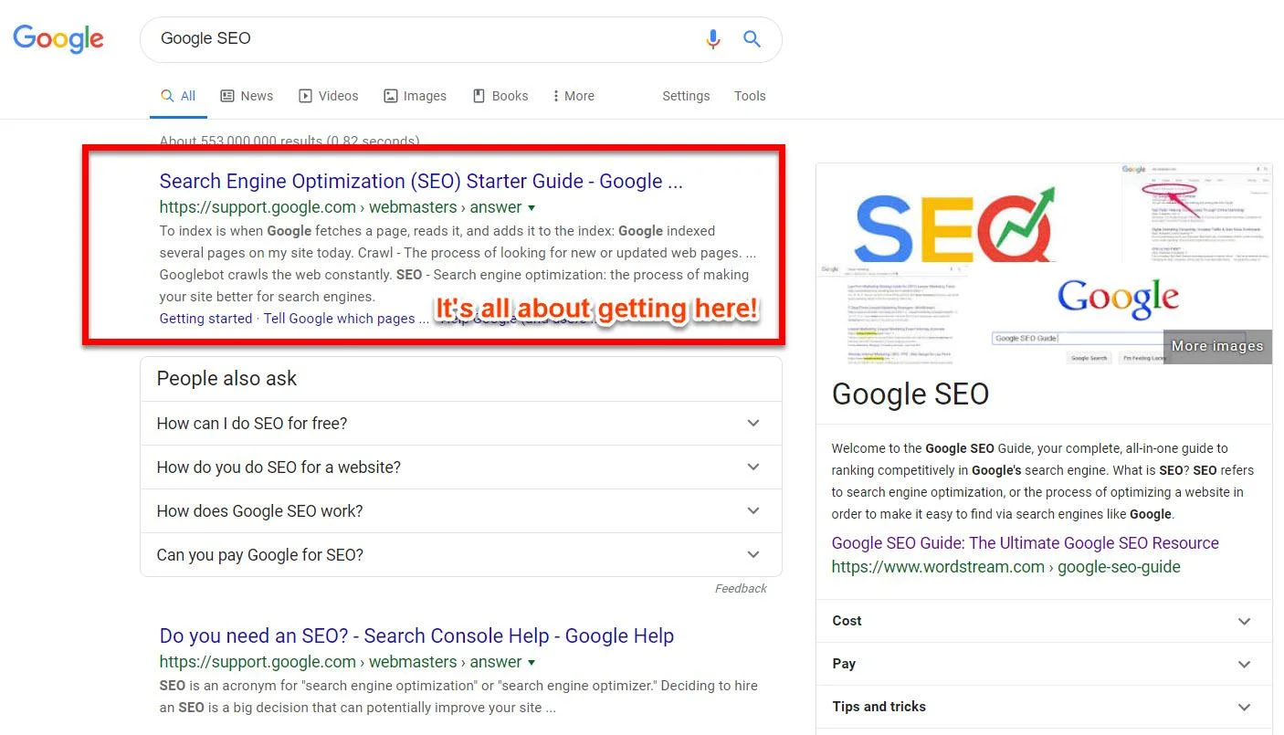
If you want to increase traffic to your website, you need to make sure it is optimized for search engines. This means that your website needs to be designed in a way that makes it easy for search engines to find and index your content.
Some things you can do to optimize your website include using keywords throughout your content, using header tags, and optimizing your images. You can also use Google Search Console to submit your website to Google and track your progress. This will ensure that your website is being found by people who are searching for the keywords you are targeting.
Web Design Mistakes #6. You Don’t Have a Domain Name
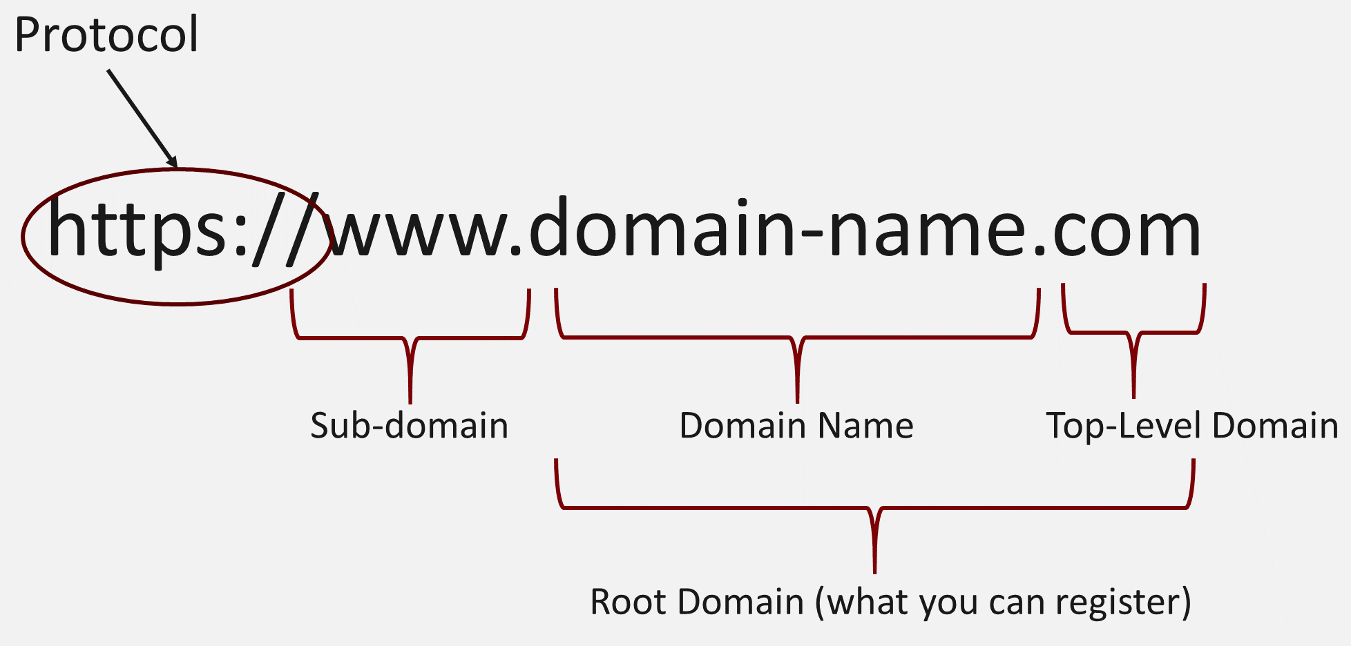
Why is domain name important? Just why? Because your domain name is your website’s address on the internet. It is how people will find your website and it should be easy to remember. If you don’t have a domain name, you are missing out on traffic from people who want to visit your website but can’t remember your URL.
You can buy a domain name from a domain name registrar such as GoDaddy or Namecheap. It is important to choose a domain name that is relevant to your niche and easy to remember.
Buying a domain name is not a costly affair compared to the returns you will get.
Web Design Mistakes #7. Your Website is Not Mobile Friendly
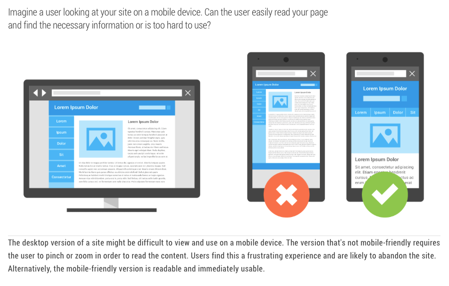
If you have read our previous article, you’d know exactly what I am talking about. Because a person who is scrolling through his mobile phone searching for a website that will offer the product or services he wants will not take pain to open his desktop again just because the website wasn’t mobile-friendly and he loves the website. In rare cases, he might, but if your website is not mobile-friendly, he will just keep scrolling and find your competitor’s mobile-friendly website.
A mobile-friendly website is designed to be viewed on a mobile device such as a smartphone or tablet. It should be easy to read and navigate without having to zoom in or scroll horizontally.
Some things you can do to make your website mobile-friendly include using a responsive design, using large font sizes, and using a mobile-friendly navigation menu. You can also use Google’s Mobile-Friendly Test tool to see how well your website performs on mobile devices.
Web Design Mistakes #8. You Don’t Have an SSL Certificate
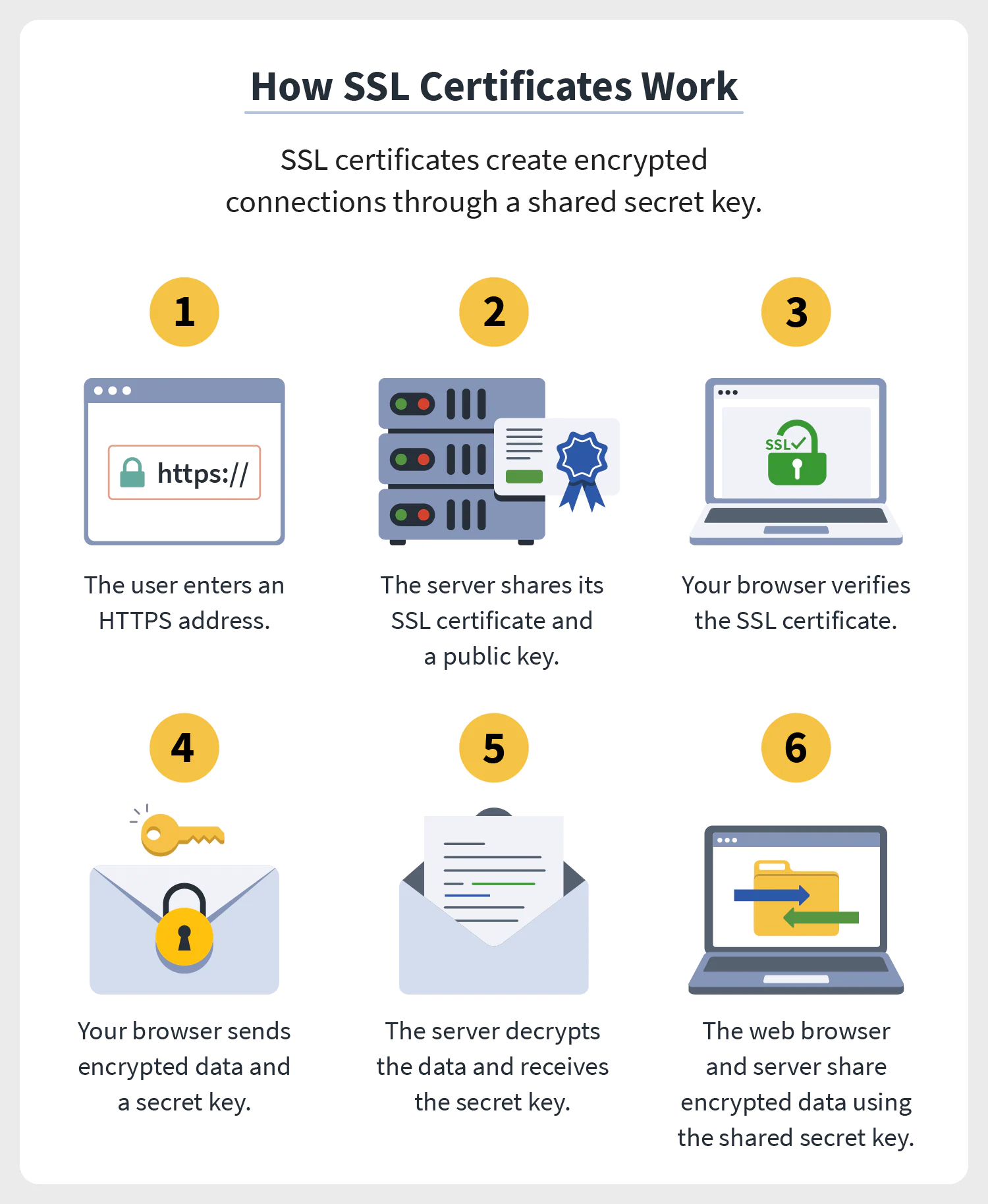
SSL certification is the little green padlock you see on the left side of the URL. It means that the connection between the website and the visitor’s browser is secure and encrypted.
SSL certificates are important because they ensure that sensitive information such as credit card numbers and passwords are not intercepted by third parties. They also help to build trust with your visitors, which can lead to more sales and conversions.
You can purchase an SSL certificate from a web hosting company or a domain name registrar. Once you have it, you will need to install it on your web server. This is a must when you want to take payments on your website.
Web Design Mistakes #9. You’re Not Offering Anything Free
Free, free, free! an ad read the other day when I was driving through a busy street in my locality. And, I bet you saw it too. Because everyone loves free stuff.
If you want to increase traffic to your website, you need to offer something for free. This could be a free ebook, a free report, or a free video course. Whatever it is, make sure it is high quality and relevant to your niche.
People are always looking for freebies, so if you can offer something of value, you will see an increase in traffic.
Web Design Mistakes #10. Your Website Has a Slow Loading Speed
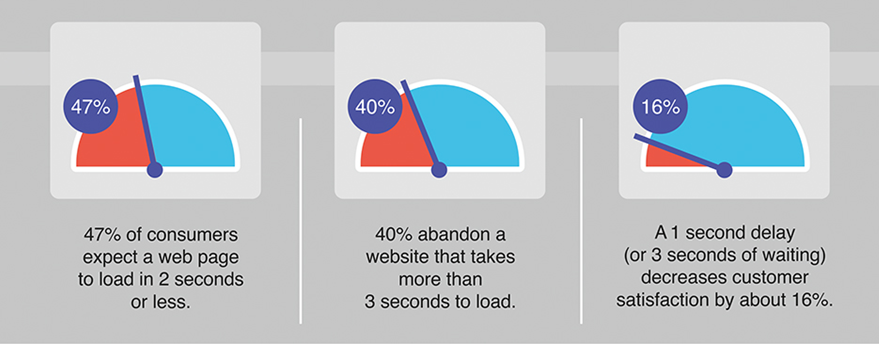
Your website has great content, great linking, and great influencers posting about you, but still, you are not generating traffic? Your website’s loading speed may be the problem. Because, no matter how good your website is, if it takes too much time to load, the chances of people staying on your website are very bleak. They will just hit the back button and find another website that loads faster.
You can use Google’s PageSpeed Insights tool to test the loading speed of your website. It will give you a list of things you can do to improve your speed.
Web Design Mistakes #11. Your Content Outdated or Boring
That might not always be the case, but when someone makes an effort to check your website religiously, then it surely is a big deal for them, because they are not getting anything new from you. When was the last time you updated your blog? Months ago or years ago?
If it has been a while since you last updated your website, it is likely that your content is out of date or no longer relevant. This can cause people to leave your site without taking any action.
To keep your content fresh, try to update it regularly. You can also add new pages, blog posts, and other types of content to keep people coming back for more.
Web Design Mistakes #12. You Only Share Your Content
How can this be a crime – you ask? Yes, it isn’t. But, if you only share your content on social media, then it looks like you are just promoting yourself and not providing any value to your followers.
Imagine if every time you went to a party, all you talked about was yourself. You would soon become the most unpopular person in the room. The same goes for social media. If all you do is share your content, people will soon get tired of it and stop following you.
To keep people engaged, try to share a mix of your content and other people’s content that you think would be interesting or valuable to your followers.
Web Design Mistakes #13. You Don’t Promote Your Content Enough
Sharing your content might sound narcissistic sometimes, but it is very important if you want to increase traffic to your website. If you don’t promote your content, no one will know it exists. Though there are limits and you shouldn’t go overboard with them, still, a little self-promotion is necessary if you want to increase traffic to your website.
There are several ways you can promote your content, such as through social media, email marketing, guest blogging, and paid advertising.
Web Design Mistakes #14. You Don’t Have an Opt-In Form
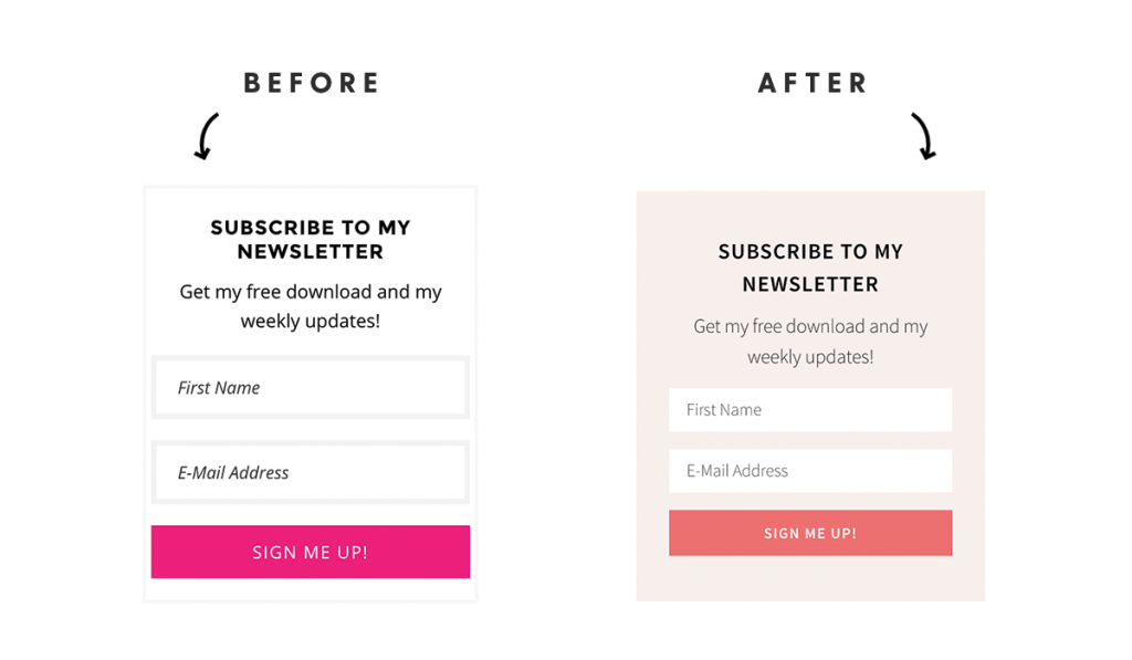
Opt-In forms are one of the most effective ways to increase traffic to your website. By having an opt-in form on your website, you can capture the email addresses of visitors and add them to your email list. This allows you to stay in touch with them and promote your content to them regularly.
If you don’t have an opt-in form on your website, you are missing out on a big opportunity to increase traffic and build relationships with your visitors.
Web Design Mistakes #15. You’re Not Collecting Emails
Collecting Emails, what’s that? I didn’t even know until recently when I started my website. It is one of the most important things if you want to increase traffic to your website. By collecting emails, you can stay in touch with your visitors and promote your content to them regularly. Make an excel sheet or any document where you save all the email addresses of people who visit your website.
You can collect emails in several ways, such as through an opt-in form, by offering a free ebook or report, or by running a contest.
Web Design Mistakes #16. You Don’t Have an Exit Pop-Up
A lot of us wouldn’t need an Exit Pop-Up if the movie is good, but by having an Exit Pop-Up, you are making sure to increase traffic to your website. An exit pop-up is a popup that appears when someone is about to leave your website. It allows you to capture their attention and promote your content to them before they leave.
Exit pop-ups can be very effective in increasing traffic to your website, but they must be used carefully. If they are used too often or are too intrusive, they can annoy visitors and cause them to leave your site.
Web Design Mistakes #17. Your Web Design Sucks
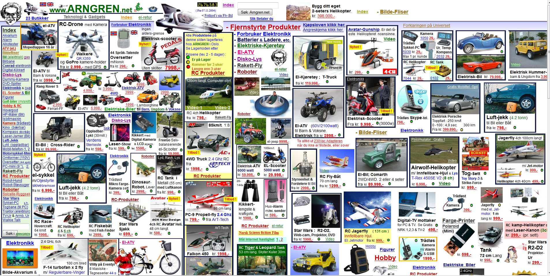
Sorry to hear, but if you are a shoe company and have garden scapes on your landing page, it confuses the visitors and they would rather leave your website than try to understand what is going on.
Your web design is important for several reasons. It affects how visitors perceive your brand, how easy it is to use your site, and how likely people are to stay on your site. If your web design is poor, it will be difficult to increase traffic to your website.
There are several things you can do to improve your web design, such as using a responsive design, using negative space, and keeping your design simple.
Web Design Mistakes #18. Your Site Takes Forever to Load
Nowadays, people have very little patience and if your website takes more than 3 seconds to load, they are gone. 40% of people will abandon a website that takes more than 3 seconds to load.
So, if you want to increase traffic to your website, you need to make sure it loads quickly. There are several things you can do to improve your site’s loading speed, such as using a content delivery network, optimizing your images, and using a caching plugin.
Web Design Mistakes #19. Your Navigation is Confusing
Let’s say, someone clicks on your services button and instead of services, they are taken to a page with information about your company’s history. That would be confusing and frustrating, right?
The navigation of your website is important because it affects how easy it is for visitors to find what they are looking for. If your navigation is confusing or difficult to use, people will quickly become frustrated and leave your site. To avoid this, don’t add too many navigation buttons or make it complicated that the users might find your navigation a maze more than a website.
Web Design Mistakes #20. You Don’t Have a Clear Call to Action
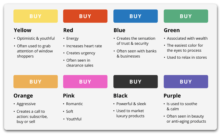
A year ago when I was scrolling through a website it said “Hey! Click here to grab the offer before it’s gone”. So I did what it said and clicked but instead of being taken to an offer page, I was navigated to a survey link that wasted my 5 minutes, on top of which I asked to complete another survey, and then another. I was so frustrated that I never visited the website again.
I know we all did this at least once, to never make the mistake again.
When you are trying to increase traffic to your website, it is important to have a clear call to action on every page. Your call to action should be specific and tell visitors exactly what you want them to do. For example, if you want them to sign up for your newsletter, make sure your call to action says “sign up for our newsletter”. If you are not careful, you might lose your customers to frustration and disappointment.
Web Design Mistakes #21. You Don’t Have Any Testimonials

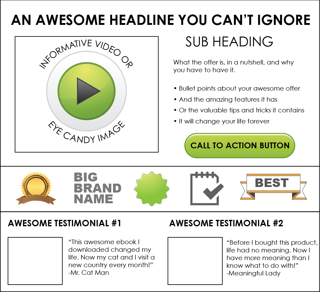
Testimonials make sure the potential customer that you are not a fraud and that others have used your product/services and were satisfied with them.
Make sure to place the testimonials in an easily accessible place, such as your homepage or your About page. If you have difficulty getting testimonials from customers, you can offer them a discount on their next purchase in exchange for a testimonial.
Web Design Mistakes #22. You’re Not Building Trust
“If you want people to buy from you, they need to trust you”. Nobody needs a degree to know that, but apparently, a lot of website owners missed that memo.
There are several ways you can build trust with your visitors, such as using testimonials, displaying security badges, and having an “About Us” page. You should also make sure your website looks professional and is up-to-date.
Web Design Mistakes #23. Your Prices are Too High
It is self-explanatory, if your prices are too high, people will be discouraged from buying from you. If you want to increase traffic to your website, you need to make sure your prices are competitive.
You can check out your competition to see what they are charging for similar products or services. You should also offer discounts and coupons to encourage people to buy from you.
Web Design Mistakes #24. You Don’t Offer a Guarantee
When people are buying something online, they want to know that they can return it if they are not satisfied. If you do not offer a guarantee, people will be less likely to buy from you.
Offering a money-back guarantee is a great way to build trust with your visitors and increase sales.
Web Design Mistakes #25. You Don’t Have an About Page
About page is a golden rule in website building, it is one of the first pages people will visit when they land on your site, so make sure it is up-to-date and tells visitors everything they need to know about you and your business.
An About page should include information such as your company history, mission statement, and contact information. You should also include a photo of yourself or your team to make it more personal.
These are some of the most common web design mistakes that can prevent your website from generating traffic. By avoiding these web design mistakes, you will be on your way to increasing traffic and reaching your full potential.
Conclusion
If you are looking out for professional help, 12 Channels can help you to create a website that looks great, is easy to use, and helps you to increase traffic and sales. Our team of experts can help you to avoid common web design mistakes and create a website that works for you. Contact us today to learn more.
Web design mistakes can be hassle when not corrected immediately, therefore learning these web design mistakes before creating a website will give you a better insight into what works well with what! Good luck!

